Checkup Booking Journey
Reimagined With Multiple Vendors
Mobile | Figma | B2C
Pazcare

The health checkup benefit on the platform had a problem that numbers make uncomfortable to ignore, users were dropping off. The existing journey offered just four checkup options with no real way to filter, compare, or add family members without friction. It wasn't broken, but it wasn't working either. The goal was clear: take a flow that felt like a form and turn it into an experience that actually helps people make confident decisions about their health.
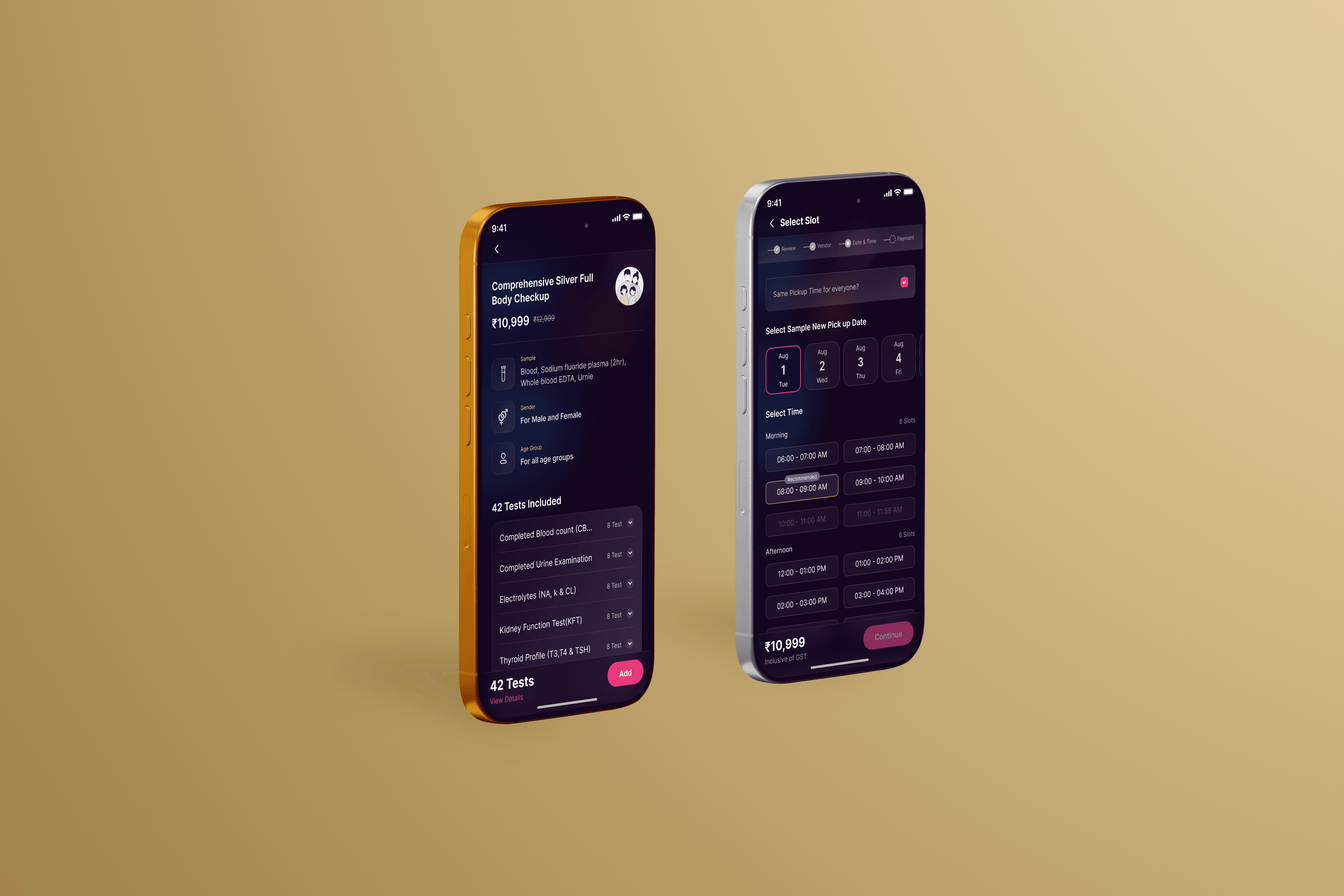
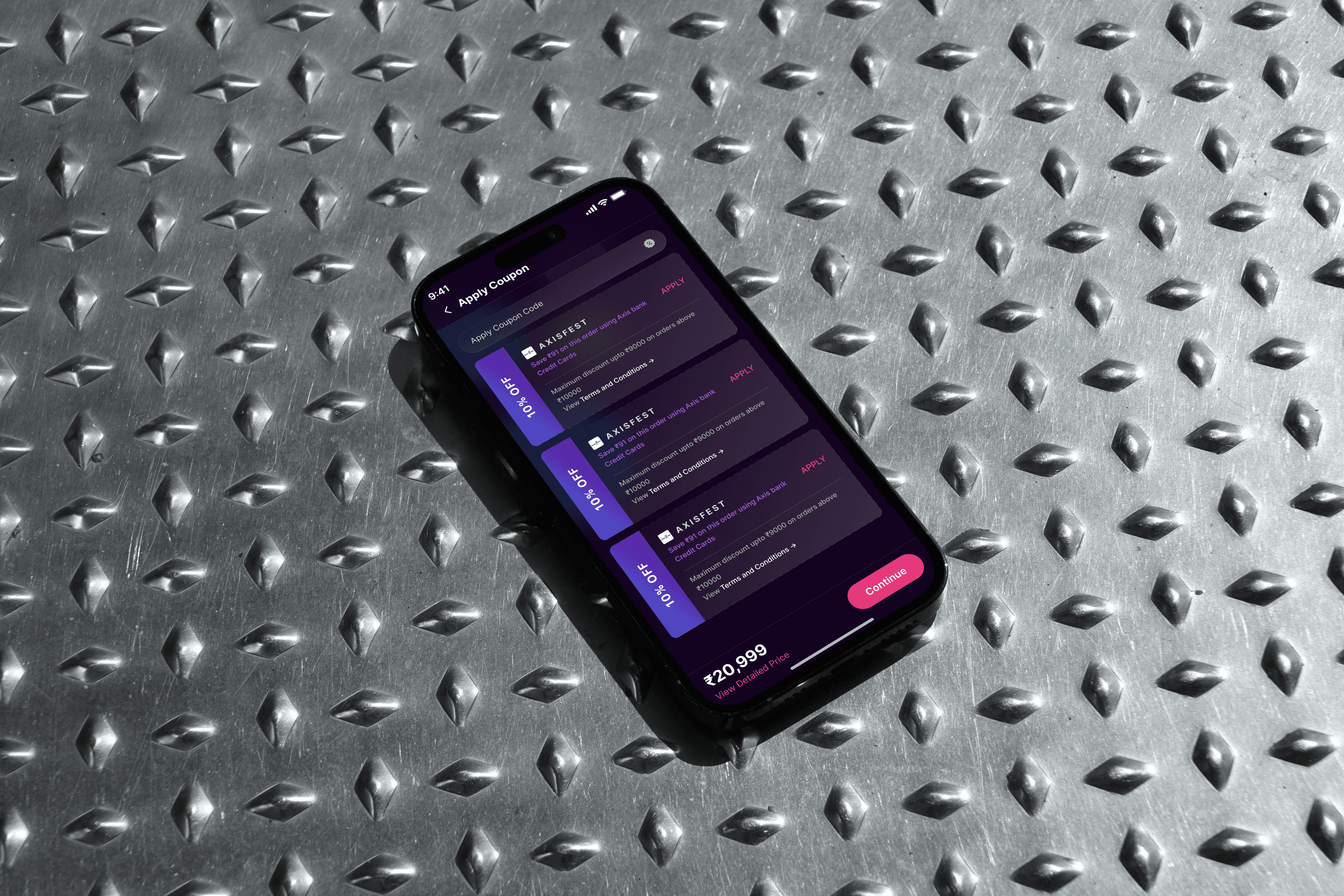
The process started well before any screen was designed. We spoke directly with users; conducted interviews, gathered qualitative data, and mapped the exact points where the old journey lost people. What came back was consistent: too few options, no way to search, confusing plan selection, and family additions buried deep in the flow. With the problems clearly defined, we moved into ideation and built an initial draft that expanded the catalog from 4 to 20 checkups, introduced tab navigation for plan selection, and gave the search bar the prominence it deserved.
Every decision went through user testing before it went live. We iterated on the design based on real feedback, not assumptions, refining the filters, the family member addition flow, and the overall information hierarchy until the experience felt intuitive at every step. Post-launch, stayed close to the project; supporting the development team during testing, and tracking performance once it was live to make sure the improvements translated into actual results.
The results spoke clearly. Within the first three months post-launch, the platform recorded a 25% increase in monthly checkup bookings, a direct reflection of how much the redesign lowered the barrier to purchase. Users could now browse a full catalog of 20 options, filter by what mattered to them, add family members without confusion, and move through the selection process with a confidence the old flow never gave them. Conversion improved, drop-off declined, and satisfaction scores followed. It's the kind of outcome that happens when a product stops guessing what users need and actually goes to find out.
