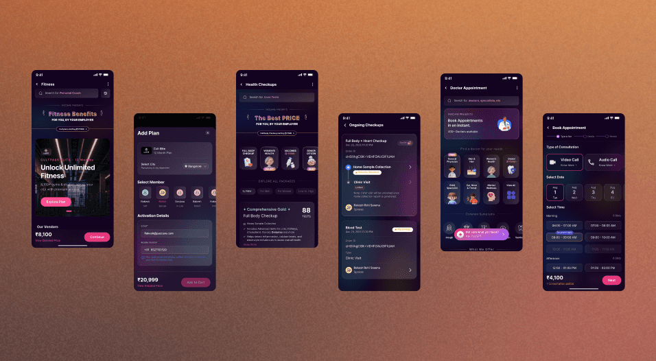
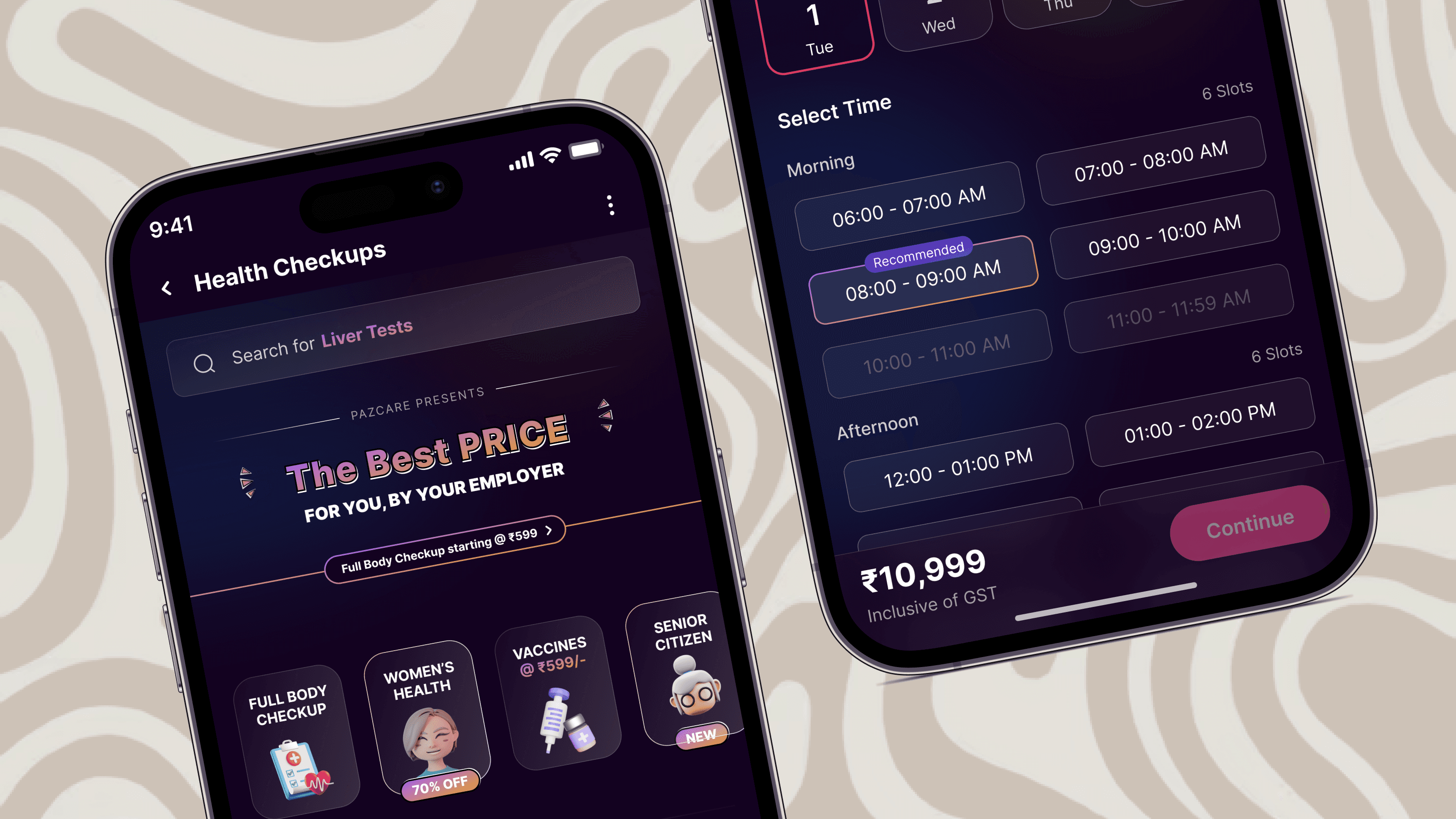
Comprehensive health checkup platform, simplifies complex medical data into intuitive, actionable user flows.
8 Months
Timeline
3; Manager + PM + Me
Team
3; Manager + PM + Me
Landscape
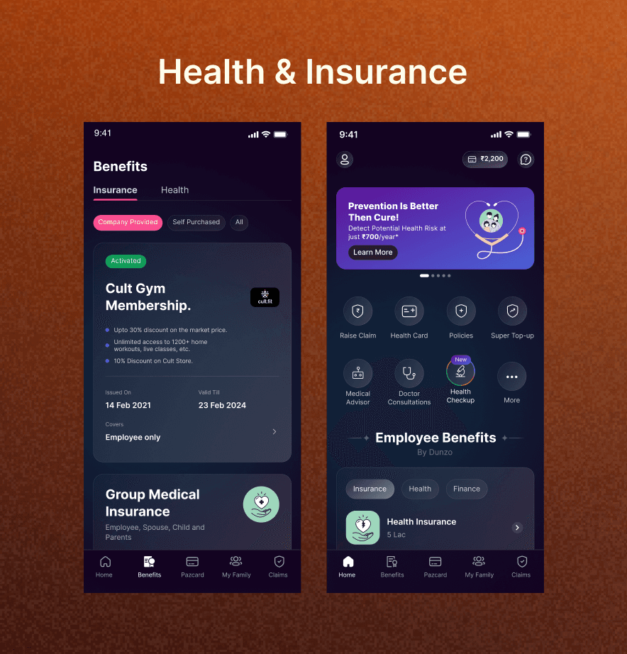
Historically, the platform's wellness benefits actively worked against the user experience. Core offerings were scattered across generic tabs, and the individual touchpoints lacked visual polish and functional depth. I identified that simply fixing the navigation wouldn't be enough; the individual segments themselves needed a complete visual and functional teardown. By pitching a unified ecosystem with natively designed journeys to the product team, the goal became twofold: fix the architecture to keep users inside the app, and elevate the UI to make them want to stay.

SUMMARY
Problem
The platform suffered from two critical failures: a deeply fragmented Information Architecture and outdated, poorly designed individual benefit journeys. Users were forced out of the app via disjointed coupon links, causing heavy drop-offs and a massive influx of support queries.
Solution
Architected a unified "Wellness" ecosystem while executing a massive UI overhaul. Designed completely new 0-to-1 in-app purchase journeys for Gym Memberships and Doctor Consultations, and fully revamped the legacy Health Checkup flow with a fresh, modern aesthetic and modular categorization.
Impact
Transformed a disorganized utility into a cohesive lifestyle platform, driving a 35% spike in engagement, slashing bounce-offs by 60%, and generating a 20–23% increase in revenue.
I operated with high autonomy while maintaining strict, iterative feedback loops with leadership. I initiated the project by pitching the consolidation to the APM. Once the PM secured approval from the Direct Manager, I managed the end-to-end design lifecycle. My workflow followed a structured cycle: aligning on requirements, proposing distinct UI variations, gathering PM/Manager reviews, testing with users, and securing final executive sign-off before development handoff.

Journey
Health Checkups (Revamp): Tore down the legacy 4-option flow and built a highly readable, modular interface supporting 20+ dynamic packages, multiple vendors, and seamless family-member additions. Gym Memberships (New): Designed a 0-to-1 in-app purchase journey utilizing a distinct, highly motivational UI pattern to encourage healthier lifestyles. Doctor Consultations (New): Built a fresh, clinical, and trustworthy booking journey from scratch, integrating it natively into the new ecosystem. To execute a redesign of this magnitude, I ran parallel workstreams focusing on both macro-level platform architecture and micro-level interface design.

Hurdle:
The most significant risk was change management: introducing a massive structural overhaul and entirely new UI patterns to an existing user base without causing friction.
Solution:
To solve this, I designed a multi-tiered transition strategy: 1. Contextual Onboarding: Integrated the new ecosystem directly into B2B client onboarding flows. 2. In-App Guidance: Designed non-intrusive, native guides to help legacy users acclimate to the new dashboard and purchase journeys. 3. Diversion Linking: Rather than deleting the old entry points immediately, I retained them but implemented educational diversion links to seamlessly route users to the new Wellness tab.
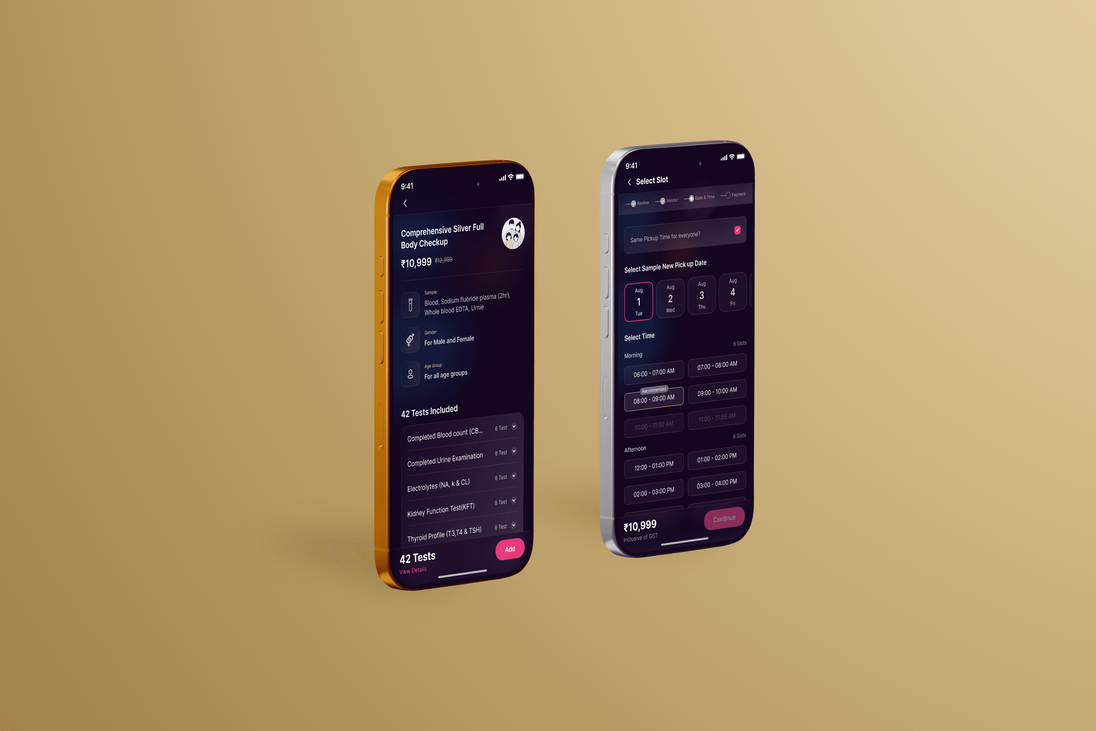
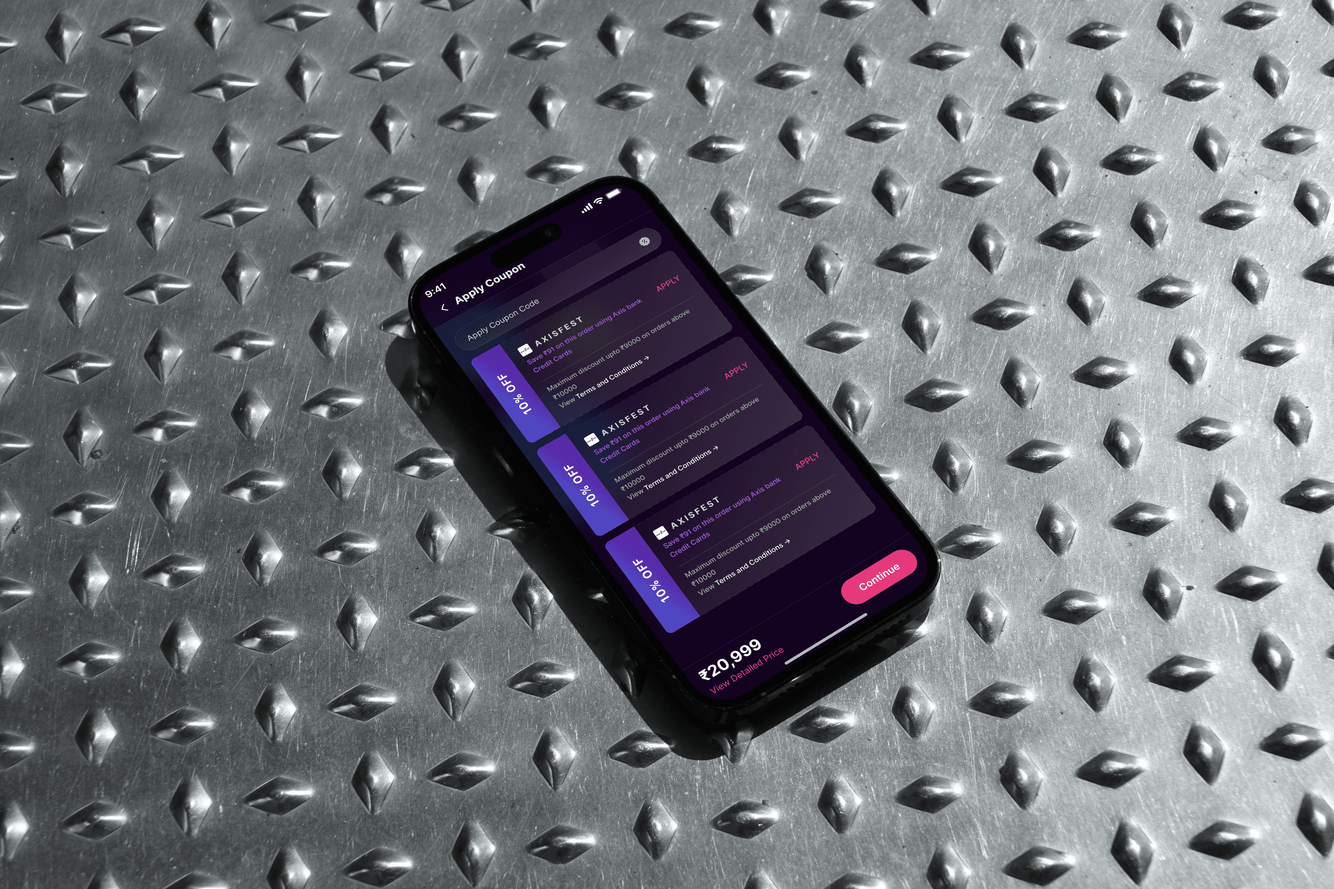
The deployment of the Wellness Dashboard successfully organized a chaotic user journey into a streamlined, highly profitable ecosystem. Users adapted rapidly to the new interfaces and architecture. To ensure continuous qualitative feedback post-launch, I embedded a native CSAT system into the journey completions. Key Metrics Achieved: 1. +35% Increase in overall user engagement across the platform. 2. -60% Reduction in user bounce-offs during the discovery and opportunity stages. 3. -55% Drop in support queries regarding feature locations and navigation. 4. +20–23% Increase in direct revenue driven by the optimized health checkup and newly introduced purchase journeys.